03
247 Tech.
A 150+ page digital platform, organised so every page is easy to find, quick to load and ready for more languages and brands.
- Industry
- Technology · Information · Internet
- Services
- Architecture · Design · Development
- Platform
- 150+ page web platform
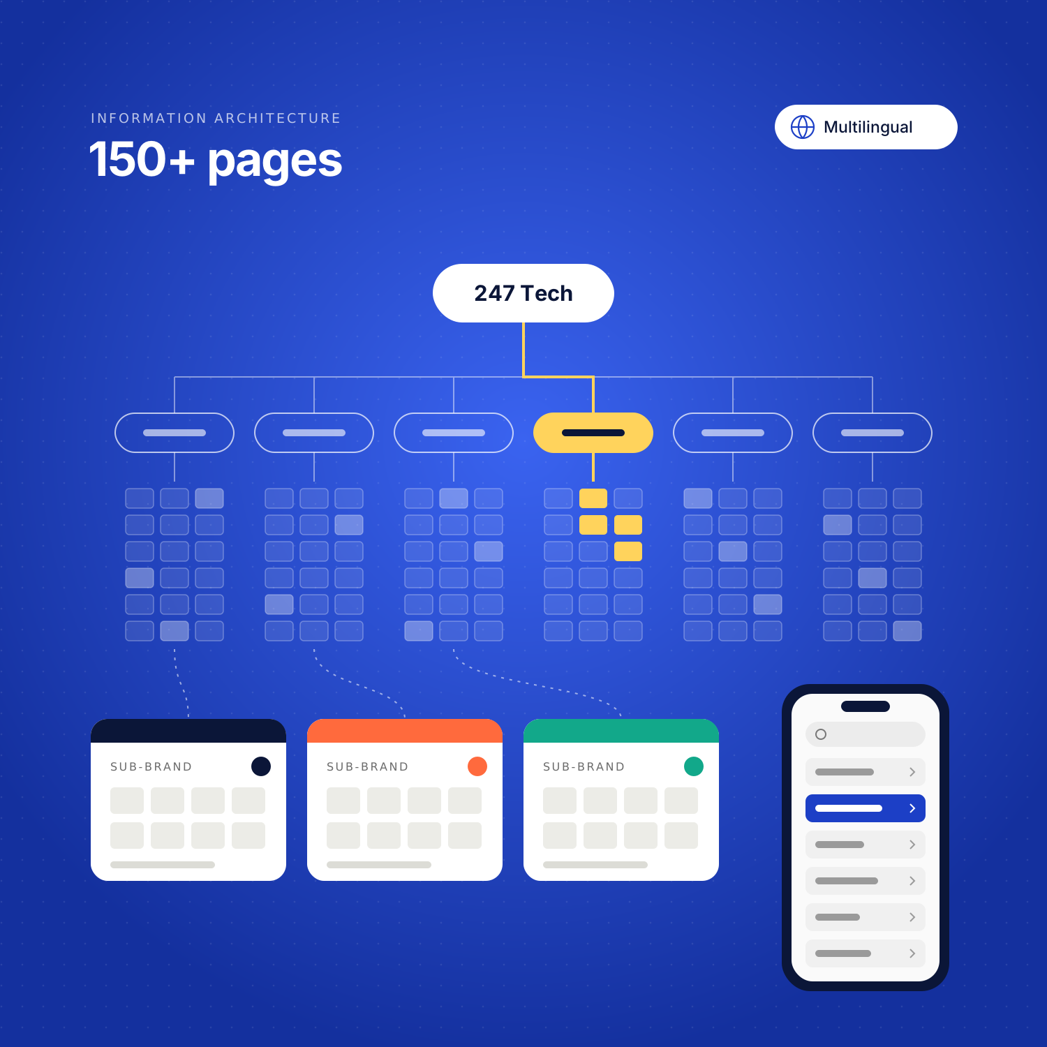
The project
150+ pages, one structure.
A large digital platform for a technology, information and internet company, rebuilt around how people actually look for information: a categorised structure, navigation that reaches any page in a few steps, and space for sub-brands inside the same system.
Underneath it, the platform had to stay fast on a phone, serve more than one language, and absorb new sections without another rebuild.
The challenge.
A site this size rarely breaks all at once. It gets harder to use one page at a time.
Past a certain number of pages, the structure stops being a diagram and starts being the product. Visitors do not browse a 150-page platform; they arrive on one page from search or a link and either find their way or leave. Every section added without a place to belong makes that a little worse.
Three further constraints shaped the work. More than one language meant content could not be hard-wired to a single version of a page. Sub-brands needed their own space without fragmenting into separate sites. And a platform that size has to stay fast on a phone connection, which puts caching, delivery and page weight in scope from the beginning rather than at the end.
- Scale150+ pages, and more expected.
- LanguagesMore than one, managed in one platform.
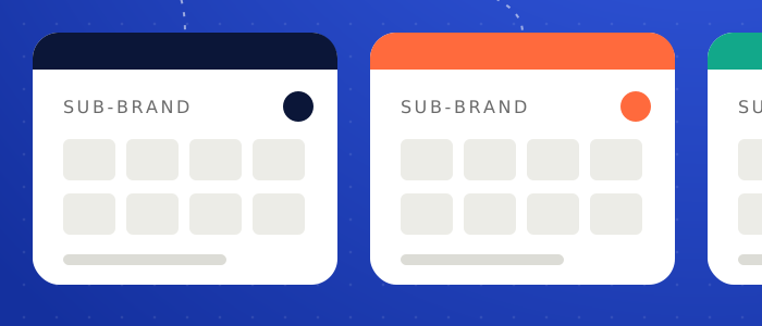
- Sub-brandsDistinct identities, shared foundation.
Approach
How we approached it.
Structure before screens: map what exists, decide where it belongs, and only then design how it is reached.
-
01Map the content
Take stock of 150+ pages and how they relate to one another.
-
02Restructure
A user-centered architecture, built around how visitors look for information.
-
03Navigate by category
Categorised navigation that makes a large platform feel small.
-
04Tune delivery
Mobile optimisation, caching, CDN and SEO across the whole platform.
Design & architecture
The architecture.
One platform, four layers: what visitors see, how it is organised, what fills it, and how it is served.
01Experience
- Landing pages
- Category pages
- Sub-brand spaces
- Mobile layouts
02Structure
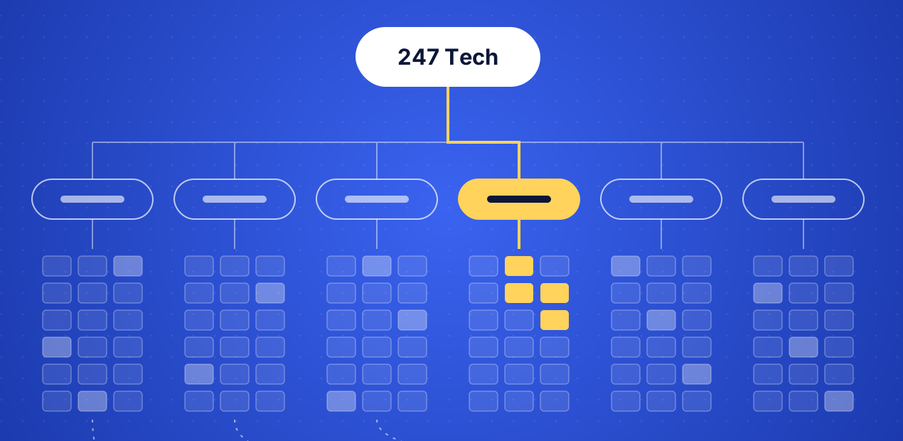
- Information architecture
- Categories
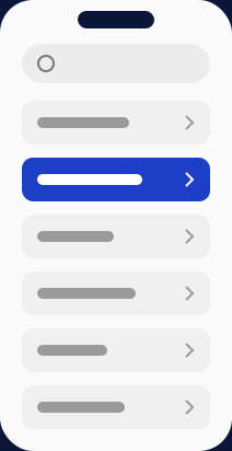
- Navigation
03Content
- Multilingual content
- Editorial workflow
04Delivery
- Caching
- CDN
- SEO
Solution
What we shipped.
Technology
The system.
The six problems a platform this size has to solve, and the engineering that answers each.
01Structure
- User-centered architectureA structure based on how visitors look for information.
- Categorized navigationClear categories that make 150+ pages feel navigable.
02Reach
- SEOStructure and metadata that help every page get found.
- Multilingual functionalityLanguage versions managed inside the same platform.
03Performance
- Caching & CDNPages served quickly, wherever visitors are.
- Mobile optimizationLayouts and assets tuned for smaller screens and slower connections.
Outcome
What it delivers.
-
01
A structure people can follow
Categorised navigation and a user-centered architecture across 150+ pages.
-
02
The same platform on a phone
Mobile-optimised layouts with caching and CDN delivery behind them.
-
03
Room to grow
New sections, languages and sub-brands fit the platform instead of forcing a rebuild.
Gallery
Project gallery
-
Information architecture
-
Sub-brand spaces
-
Mobile navigation
Next project
FZ OTT
Start a project
Have something worth building?
Tell us what you’re building. We’ll tell you how we’d approach it, and what it takes to get there.
Let’s talk